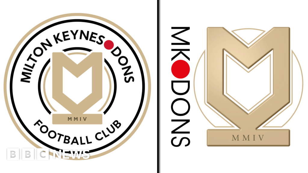
A new crest for MK Dons has been created with a nod to the city's "iconic roundabouts". The League Two football club said the circular design in white, black, gold and red brought together its "heritage, ambition and modernity". The club was taken over by aKuwait-based consortiumin August. One supporter said "we might have opened up for some flack with the roundabout link", while others commented on the continued use of "Dons" in the design. The club's chairman, Fahad Al Ghanim, said: "The evolution of our club crest marks a new era for Milton Keynes Dons. "After a transitional season, we can now look forward with renewed optimism as we invest in all aspects of the club and look to build the foundations for sustainable success in Milton Keynes." MK Dons finished 19th in League Two this season. Club chief executive Neil Hart said it was the "right time" to change the crest, adding it was "an evolution". "Supporters will start to see that brand and crest appear physically around the stadium and digitally across all of our platforms over the course of the summer." The club said it consulted on the design with MK Dons Supporters' Board and season ticket holders. The crest brought together "our heritage, ambition and modernity in a way that's built to stand the test of time", it added. "But it also nods to something closer to home - Milton Keynes' iconic roundabouts. "It's a subtle tribute to the city's unique identity, woven seamlessly into the heart of our new look." Club supporter, Ryan Ray, told the BBC: "I understand the new owners wanting a new regime and wanted some input. "It's good there's a nod to our past - the Dons remains." However, he added: "We might have opened up some flack with the roundabout link." A fan on the club's Facebook page, said: "Surely we're more than roundabouts as a city." Designed in a grid system, Milton Keynes is well known for its roundabouts,boasting about 130 of them. Meanwhile, another supporter on social media said he was "glad the club kept the Dons in the name", but another disagreed and said the only "way you'll ever be taken seriously is dropping the Don". Controversy surrounding the name began after Wimbledon FC - nicknamed "the Dons" -relocated to Milton Keynes in 2003. The move sparked the formation of separate club AFC Wimbledon, which reached the League Two play-offs this season. Follow Beds, Herts and Bucks news onBBC Sounds,Facebook,InstagramandX.
MK Dons' new crest a 'nod to iconic roundabouts'
TruthLens AI Suggested Headline:
"MK Dons Introduces New Crest Inspired by Milton Keynes Roundabouts"
 Bbc News
8.7
Bbc News
8.7
TruthLens AI Summary
MK Dons has unveiled a new club crest that pays homage to Milton Keynes' distinctive roundabouts, reflecting the city's unique identity while merging elements of heritage, ambition, and modernity. The circular design features colors of white, black, gold, and red, symbolizing a fresh start for the League Two football club, especially following its recent acquisition by a Kuwait-based consortium in August. Club chairman Fahad Al Ghanim expressed optimism about this new chapter, stating, "The evolution of our club crest marks a new era for Milton Keynes Dons." He emphasized the club's commitment to investing in its future and building a foundation for sustainable success, particularly after the team finished 19th in League Two this past season. This rebranding comes as part of a broader initiative to rejuvenate the club's identity and engage with its supporters, as noted by club chief executive Neil Hart, who described the crest change as an evolution rather than a complete overhaul.
The design process involved consultations with the MK Dons Supporters' Board and season ticket holders, ensuring that the new crest resonates with the fanbase. While many supporters appreciate the modernized look and the retention of the name "Dons," some expressed concerns over the roundabout reference, suggesting that it may not reflect the entirety of Milton Keynes' identity. Comments on social media reveal a mix of pride and apprehension, with some fans welcoming the nod to local culture while others feel the club should be recognized for more than just its roundabouts. The city is notable for its grid layout and approximately 130 roundabouts, which have become a defining characteristic. The crest's unveiling marks not only a visual change but also a strategic move towards fostering a stronger connection with the local community amid the ongoing legacy of the club's controversial origins following the relocation of Wimbledon FC in 2003.
TruthLens AI Analysis
The article highlights the unveiling of a new crest for MK Dons, a football club in League Two, which references the city's well-known roundabouts. The design aims to merge the club's heritage with a modern approach, as expressed by the club's leadership following a recent takeover by a consortium based in Kuwait. This development appears to be part of a broader effort to revitalize the club and engage with its supporters after a challenging season.
Purpose of the News Release
The article serves to inform fans and the general public about the new crest, indicating a shift in the club's branding and vision. By emphasizing the connection to the local identity through the roundabouts, the club aims to foster a sense of community and pride among supporters. The leadership's statements about a "new era" suggest an intention to create optimism and encourage support during a transitional phase.
Public Perception and Reactions
The reactions from supporters are mixed, highlighting a potential divide in how the new crest is received. While some appreciate the nod to local identity, others feel the focus on roundabouts may trivialize the city’s broader identity. This indicates that the club's management is aware of the delicate balance between honoring heritage and promoting a modern image.
Transparency and Hidden Agendas
It appears there is no significant hidden agenda behind this announcement. However, the emphasis on local identity could be seen as a strategic move to distract from the club's recent performance struggles, having finished 19th in League Two. By focusing on the crest and community engagement, the club might be attempting to shift attention away from past shortcomings.
Reliability of the News
The article seems to provide a factual account of the crest launch, supported by quotes from club officials and fans. There is no indication of manipulation or bias, suggesting that it is a reliable source of information. The focus on community sentiment and the club's ambitions lends credibility to the report.
Connection to Broader Trends
This news release may link to wider trends in sports branding where clubs are increasingly focusing on their local identity to strengthen community ties and enhance their image. The emphasis on design evolution could reflect a growing recognition of the importance of branding in sports, particularly after changes in ownership.
Impact on the Community and Economy
The introduction of a new crest could positively affect the club's relationship with its supporters and the local economy, as successful branding can lead to increased merchandise sales and attendance at matches. As the club invests in its future, this could also improve its competitive standing and community involvement.
Target Audience
This news likely resonates more with local supporters and fans who have a vested interest in the club's identity and future. By engaging with the supporters’ board, the club seeks to appeal to a demographic that values tradition while also embracing modernity.
Potential Market Reactions
While the news might not have a direct impact on stock markets or financial markets, it could influence local businesses and sponsor interest in MK Dons. A successful branding initiative can lead to increased visibility and revenue opportunities.
Geopolitical Context
The article does not have significant geopolitical implications, but it does reflect ongoing trends in sports ownership and investment from foreign entities in local clubs. This may resonate with broader discussions about globalization in sports.
Use of Artificial Intelligence
There is no clear indication that AI was used in the writing of this article, nor does it appear to reflect any specific AI-generated language patterns. The narrative is straightforward and focused on reporting facts, with no evident manipulation of sentiment or tone that would suggest AI intervention.
In conclusion, the news article on MK Dons' new crest appears to be a genuine attempt to engage with supporters and reflect the club's aspirations. It provides a factual account without apparent bias, making it a reliable source of information on this development.