‘I’ve met people with tattoos of it’: Andy Vella on shooting the Cure’s Boys Don’t Cry album cover

TruthLens AI Suggested Headline:

"Andy Vella Reflects on the Iconic Cover of The Cure's 'Boys Don’t Cry'"

View Raw Article Source (External Link)
Raw Article Publish Date:
AI Analysis Average Score: 8.6
These scores (0-10 scale) are generated by Truthlens AI's analysis, assessing the article's objectivity, accuracy, and transparency. Higher scores indicate better alignment with journalistic standards. Hover over chart points for metric details.

TruthLens AI Summary

Andy Vella, the photographer behind the iconic cover of The Cure's 'Boys Don’t Cry,' reflects on the enduring legacy of this image, which has been reproduced countless times, even inspiring tattoos among fans. Vella recalls the shoot that took place during the video recording, where he captured spontaneous moments while trying not to interfere with the band. He highlights Robert Smith’s unique hand gesture, which conveys a sense of relaxation, and admires the dramatic silhouette that perfectly encapsulates the essence of The Cure. Despite the challenges of working with clients who may not have a clear vision, Vella appreciates the clarity and direction provided by Smith, which leads to successful collaborations. The creative process involves a blend of spontaneity and intuition, as Vella describes how he often didn’t know the outcome of his shots until they were developed, revealing the beauty of unpredictability in photography.

Vella shares the story of how a film jammed during the shoot, leading to a moment of uncertainty. Fortunately, the developing process yielded a striking photograph that both Smith and the band's manager recognized as the perfect choice for the album cover. While the original image is black and white, Vella enhanced it with subtle colors for the record release, maintaining a balance between realism and artistic expression. His deep appreciation for album art is rooted in his youth, where he would immerse himself in record covers, inspired by iconic designs such as Pink Floyd's 'Meddle.' Now, as he mentors aspiring designers, Vella emphasizes the importance of passion and talent in navigating the music industry's creative landscape. His recent work, alongside 700 unique artist-designed record sleeves for a global online auction benefiting War Child, showcases his ongoing commitment to both art and social causes, cementing his influential role in music photography.

TruthLens AI Analysis

The article provides an insightful perspective on Andy Vella’s experience while shooting the iconic album cover for The Cure’s "Boys Don’t Cry." It reflects on the significance of this image within the music and art communities, illustrating its cultural impact and the personal connection that fans have with it. Through Vella's recollections, the piece demonstrates the spontaneity and creativity behind capturing a moment that has resonated with many people over the years.

Cultural Significance

Vella mentions that the image has been widely reproduced and even tattooed by fans, highlighting its deep-seated significance in popular culture. This speaks to the emotional connection fans have with The Cure and their music, suggesting that the image is not merely an album cover but a symbol of identity for many individuals. The emphasis on bootlegs being of poor quality also underscores the original image's value and the desire for authenticity among fans.

Creative Process

The discussion of Vella's creative process reveals the challenges photographers face, particularly when working with bands that have a strong vision. His experiences with Robert Smith and the band exemplify the collaborative nature of creative endeavors in the music industry. Vella’s anecdote about the film jamming and the eventual success of the shoot emphasizes the unpredictability of artistic work, where chance can lead to remarkable outcomes.

Emotional Resonance

The article captures the emotional resonance of the image, describing it as "reflective" and "mysterious." This portrayal aligns with The Cure's broader musical themes, suggesting that the visual aesthetic is intricately linked to the band's identity. The way Vella appreciates the silhouette of Robert Smith further solidifies the connection between visual and auditory art forms.

Public Perception and Connection

The narrative encourages readers to appreciate the depth behind what might initially seem like a simple album cover. By showcasing the backstory and the craftsmanship involved in producing the image, the article aims to foster a deeper understanding and appreciation for The Cure and its artistic contributions. There may not be an overt agenda to manipulate public opinion, but rather to celebrate and elevate the band's legacy.

Trustworthiness of the Content

This article appears to be reliable as it offers a personal account from a key figure involved in the creation of a culturally significant piece of art. Vella's reflections are authentic and grounded in firsthand experience, providing readers with a genuine insight into the creative process. While the article may evoke a certain nostalgia or admiration for The Cure, it does not seem to manipulate facts or present misleading information.

In summary, the article serves to illuminate the artistic journey behind a well-loved image, fostering a connection between the band, the photographer, and the audience. It highlights the significance of creativity in the music industry while also celebrating the lasting impact of The Cure on fans and culture at large.

Unanalyzed Article Content

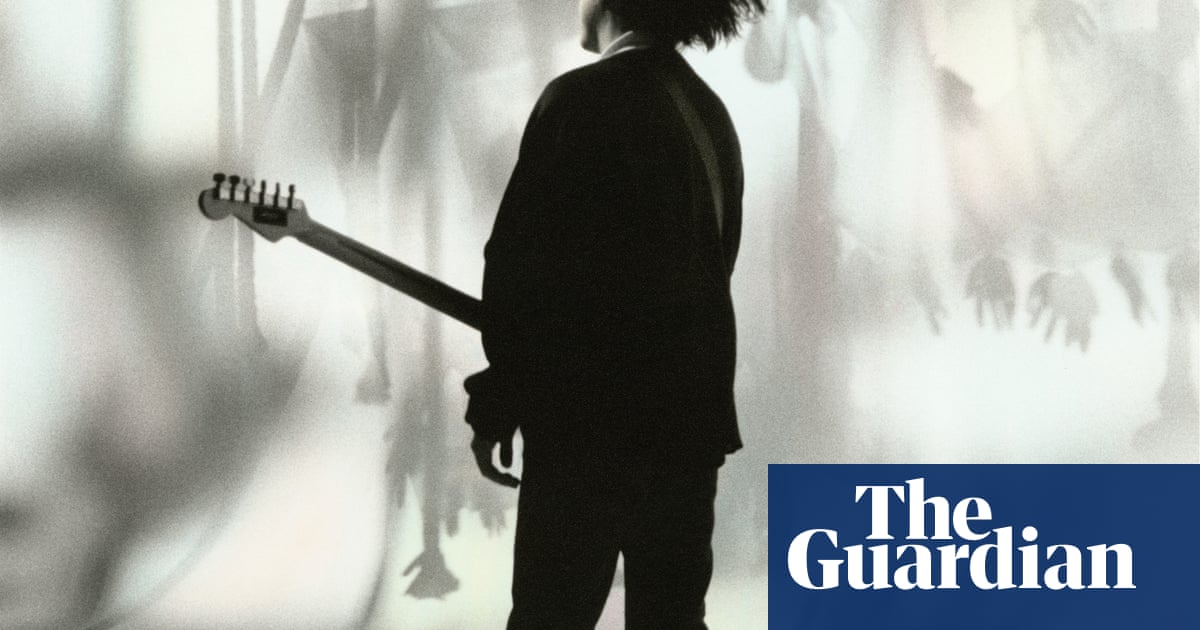
Ithink this is the Cure image that’s most reproduced. I’ve met people with tattoos of it. It’s been bootlegged, like, millions of times. The bootlegs are rubbish, though – half the time someone’s obviously cut the stencil out with a scalpel, and it’s so crude.

This image was used for the cover of Boys Don’t Cry when it was rereleased in 1986. It was taken during the video shoot, which featured three boys playing the band when young. I used to just go to those shoots as a fly on the wall, grabbing shots where I could – you try to not get in the way.

Robert Smith does that thing with his hand when he relaxes – I guess playing guitar must be quite tiring on the hands – so there’s a lovely restfulness about the image. I like how reflective it is. The silhouette of Robert was always interesting to me: the guitar, the hair, it always seemed to work. I like the dramatic, mysterious feel of the image.

I’ve worked with clients who are not specific about what they want, and you’re always thinking in the back of your mind: “Am I doing the right thing?” Every creative probably goes through that. But Robert knows what he wants: it’s good to work with people like that.

I started collaborating with the Cure in 1981. Whenever we did a shoot, the band would ask: “Do you think you got something good?” And I would say: “I don’t know until I’ve developed it.” You’re grabbing things, you’re playing with spontaneity. You see stuff through the viewfinder, and you’re composing in that. It was only later on in my career that I also started taking Polaroids.

On this shoot, though, the film jammed. I wound it back into the camera, hoping for the best. When I took it to the lab I said: “I’m not sure anything’s on this.” But there was, and when I showed the pictures to Robert and the band’s then manager, Chris Parry, the next day, they jumped up and down and said: “That’s the picture we’re going to use.” It was frame 21 on the film and it had jammed at 22 – I was lucky. That’s the beauty of this kind of work: sometimes we’re successful because of the choices that we make, but sometimes it’s the choices other people make.

The original image is black and white but the record cover is a colourised version, where I’ve used photographic dyes on top of the print. There are slight pinks and yellows and things in there, but it’s subtle. I was taught at art school to add and enhance, not take away, so I still wanted it to feel on the monochromatic scale. I didn’t want it to look too tripped out, I wanted it to have realism. But I do think I captured exactly who the Cure are with that picture, and it’s been tried and tested since with the amount of people who relate to it.

When I was younger, I had a paper round specifically so I could buy records. Then I would hide away in the corner of my house with headphones on, immersing myself in the record sleeves. I remember thinking Meddle by Pink Floyd was the best thing. It’s just a brilliant cover –a big ear with water droplets on it. It was trippy and amazing and summed up a brilliant album. Now I’ve got students who want to get into music-industry design. I don’t know if it’s easy or difficult today, but I think if you’ve got talent and passion, you can do whatever you want.

Until 1 June, 700 unique artist-designed record sleeves, including Andy Vella’s new the Cure design, are in aglobal online auctionin aid of War Child, the specialist charity for children caught in conflict

Born:Hampshire, 1961Trained:Royal College of ArtInfluences:Man Ray,André Kertész, Raoul Ubac, WolsHigh point:“There are three: being invited by War Child to design a sleeve forSecret 7” 2025; having myObscure book of photographsexhibited in Sydney Opera House in 2019; and, at Mick’s request, shooting Mick Rock’s portrait”Low point:“Not having my camera with me when I see a great photo!”Top tip:“Shoot loads. Think of the composition within the frame, and what it is you are trying to capture or communicate. Use light, fogging or real distortion for effects rather than relying on post-production. Go for authenticity. I try not to get bogged down with the technical, I aim for what I am after and allow all mistakes to hijack what it is I am creating.”
Back to Home
Source: The Guardian