Don’t go up the wall: how to pick paint colours for your home

TruthLens AI Suggested Headline:

"Guidelines for Selecting Paint Colors in Home Decoration"

View Raw Article Source (External Link)
Raw Article Publish Date:
AI Analysis Average Score: 7.9
These scores (0-10 scale) are generated by Truthlens AI's analysis, assessing the article's objectivity, accuracy, and transparency. Higher scores indicate better alignment with journalistic standards. Hover over chart points for metric details.

TruthLens AI Summary

Choosing paint colors for home decoration can be a daunting task, particularly given the vast array of options available. The article highlights the observation that women tend to dominate domestic decor decisions, possibly due to biological factors that enhance their color perception. With the author’s extensive experience in color-matching and consulting, he recounts instances of clients opting for unusual color schemes, such as a deep purple and yellow combination inspired by a sports jersey. Although these examples are outliers, the majority of clients prefer subtle hues that reflect light and create a sense of space. The complexity of color selection can lead to stress, even among industry professionals, as demonstrated by a finicky decorator who insisted on matching paint to a minuscule spot on an antique table, resulting in an unsatisfactory outcome.

The article also discusses the challenges of accurately matching colors in various contexts, such as on surfaces like render and Venetian plaster, where texture complicates the process. For those overwhelmed by the abundance of choices, the author recommends starting with just three shades of white, as most paint companies provide a curated selection of popular whites. Understanding the influence of light on color is crucial, as well, with modern LED lighting offering a broader spectrum than traditional incandescent bulbs. The article further advises caution for expectant parents who may feel the urge to redecorate before a child's arrival, suggesting that they postpone such projects due to potential toxicity in paints. Overall, while painting can be a laborious task fraught with challenges, it also presents an opportunity for personal expression and creativity in home design.

TruthLens AI Analysis

The article delves into the complexities of choosing paint colors for home decoration, highlighting the influence of gender on color choices and the subjective nature of taste in interior design. The author draws on personal experiences and client anecdotes to illustrate the challenges associated with color selection in home decor.

Gender and Color Perception

A significant point raised is the difference in color perception between men and women. The author notes that women tend to make more domestic decor decisions, attributed to biological factors such as a lower incidence of color blindness and the unique ability known as tetrachromacy. This insight aims to underline the nuanced relationship between gender and aesthetic choices, suggesting that women may have a more refined sense of color.

Client Anecdotes and Taste

The article recounts various instances of clients with unconventional color preferences, emphasizing that while some seek bold and unique schemes, the majority favor more subtle hues that enhance space and light. This juxtaposition of extreme tastes showcases the broad spectrum of client desires, which can lead to both satisfaction and distress in the decision-making process.

Professional Pressures

The author reflects on the pressures faced by both clients and industry professionals when selecting colors, citing an example of a decorator whose high standards led to frustration. This highlights the subjective nature of design and the stress that can accompany the pursuit of perfection in home aesthetics.

Public Perception and Implications

The article subtly suggests that the overwhelming choices available in paint colors can lead to decision paralysis, impacting consumer behavior in home decorating. This could potentially influence the marketplace by driving demand for expert consultations and services in design, as individuals seek to navigate the complexities of color selection.

Potential Manipulative Elements

There may be an underlying manipulation regarding the portrayal of gender roles in home decoration. By emphasizing the disparity in color perception linked to gender, the article could be seen as reinforcing traditional stereotypes about domestic responsibilities. However, it also opens the floor for dialogue about inclusivity in design choices.

In terms of reliability, the article presents personal anecdotes and observations rather than empirical data, which may affect its credibility. However, the insights offered are valuable in understanding the dynamics of color choice in home decor.

The article may resonate more with audiences interested in interior design, particularly women who are often the primary decision-makers in such matters. It speaks to individuals navigating the complexities of home aesthetics, potentially influencing consumer behavior in home improvement sectors.

Overall, the article offers a blend of personal experience and societal observations, which can provoke thought about gender roles and individual taste in home decoration.

Unanalyzed Article Content

“We offer 15,000 whites. Pick any three.”

I more often give this advice to female clients, since in 40 years restoring, colour-matching and consulting I’ve seen most domestic décor decisions made by women. Apart from any cultural aspect, studies of human biology suggest a reason: only one in 200 women is colour blind compared with one in 10 men (even more, I suspect, are partially afflicted). Tetrachromacy – the ability to see a far broader range of colours – is also only found in females.

This innate ability to define hues accurately doesn’t stop some women favouring odd colour schemes, I’ve found. I once matched paint to a Melbourne Storm jersey – deep purple, black and bright yellow – for the house and fences of a rugby fan. She showed me the result. I hoped the neighbours liked it; I didn’t. One like-minded young man had me turn the walls and ceiling of hisboydoirvampire-violet to match the satin sheets on his circular bed. “The ladies really go for it,” he later told me, proudly displaying the image of a claustrophobic bat cave, complete with bile-yellow lava lamps.

Of course, these clients are outliers. Most choose subtle hues and wall colours that better reflect light and visually enlarge spaces. But with so much choice, colour schemes can be complex. I’ve known some people who find choosing colours excruciating. This can include industry professionals.

I worked with one notoriously finicky decorator who insisted our restoration team match entire walls to one fingernail-size spot on an 18th-century table. It wasn’t possible, and we told her so, but she insisted, and the result wasn’t what she’d hoped for.

This pressure for perfection was evident when I prepared paint and offered advice for The Block contestants in 2023. The show revealed that taste, decorating talent and stamina are not equally distributed, and I often shared the stress, especially when asked to match a deep-green bathroom tile for a frantic participant. The tile’s texture made our $12,000 German colour-matching device useless, so it was down to my eyes. I finally got it – but only after 11 steps, cautiously approaching the desired shade with tiny increments of valuable pigment to avoid overshooting and having to backtrack or, worse, producing a wasteful mis-tint.

My abilities meet their match when it comes to render. When restoring this widely used, problematic surface coating, I’ve found it’s best not to touch-up but to re-paint entirely. Render’s rough texture prevents accurate machine matching, and its micro shadowing means the identical colour from a flat surface won’t appear the same. As for matching that Block favourite, Venetian plaster, which is variable in colour across broad areas due to its depth and transparency, forget about it. I was also forced to point out that matching from a phone image is never wise. When it comes to accuracy, digital still lags far behind reality.

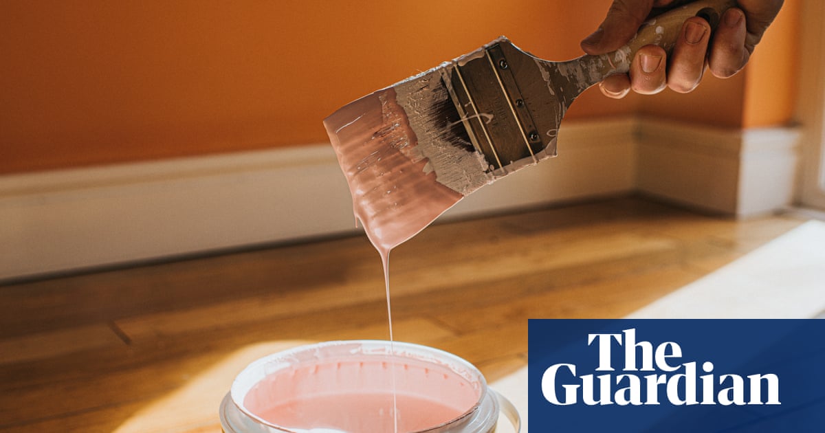
To reduce the stress of TMC (too much choice) I recommend initially picking just three whites for walls. Most paint companies help by featuring a limited range of “popular” whites, covering the three primary colours in the visible spectrum.

These “whites” contain combinations of pigments leaning towards blue (cool), red (warm) or green (neutral). When choosing samples, it helps to keep a “pure” vivid-white swatch as a reference, and fan your shortlisted colours out across one another to distinguish their slight differences.

If you prefer a particular colour, ask your decorator or paint mixer to identify the pigments in a formula, or even to combine them without a base to reveal the fundamental hue before it’s “whited” out.

Of course, décor colour is influenced by light, and today’s LEDs offer more wavelength range than the warm white of superseded incandescent bulbs. So it’s a good idea to test swatches or sample pots in natural and artificial light before deciding.

It’s important outside too. I’ve seen many people unhappy with an exterior grey that turned a shade of puce in afternoon or morning sunlight. Unless you like puce – it originally emulated bloodstains from squashed bugs on French bedsheets – I recommend choosing a neutral, green-based grey. Like whites, most greys (which I find are the hardest colours to match) can be steered in the same three spectrum directions by different proportions of blue-based black, with red and yellow ochre.

One of my more unwelcome pieces of advice challenges expectant parents’ “nesting instinct” – the urge to redecorate before the big event. I discourage this for two reasons: it’s stressful; and most paint is toxic. If I can’t persuade the client to postpone the project, I recommend a low VOC product (never oil-based enamels), thoroughly ventilating, staying hydrated (paint’s dryers and oxidants desiccate humans too), and using an activated carbon respirator – or just getting a non-pregnant partner or painter to do the job.

Though painting is painstaking and potentially hazardous work, there’s a kind of meditative fun to be had colouring your world, experimenting with the endless permutations available and then beholding the results – fresh, clean, vibrant spaces that demonstrate your individuality and sense of good taste. Unless you choose puce, that is.

Back to Home
Source: The Guardian